The online service that transforms your spreadsheets like never before!

Archive for February, 2011

Reminder! Phase 1 of Datawunder beta ends today…

Phase 1 of the Datawunder beta is almost at an end. All the feedback received from our beta testers will enable us to create and deliver a better final product for you.

We hope that with a larger base of people using and testing Datawunder, a larger amount of feedback will be received, enabling us to fix problems sooner, roll out new features at a rapid pace, as well as taking into consideration user requests for features.

As part of the beta, we have a small survey we’d like you to participate in.

As an incentive, we will be giving out an iPod Nano to the user who provides the best feedback for each phase of the beta.


View: Global Remittance Outflows [1985-2009]

Last time, I posted a little bit about ‘Global Remittance Inflows’. This time around, it’s all about the opposite – ‘remittance outflows’.

The view provides us with the total amount of remittance outflows’ from each country during the period 1985-2009.

Which nation contributes the most remittance income? Is this because it pays higher wages or employs more individuals?

How do developed nations fare in the disbursement of remittance income?

Have there been changes in the outward flow of income over the 25-year period?


Global Remittance Outflows [1985-2009]

View: Global Remittance Inflows [1985-2010]

A remittance is a transfer of money by a foreign worker to his or her home country.

“Money sent home by migrants constitutes the second largest financial inflow to many (developing) countries, even exceeding international aid.”

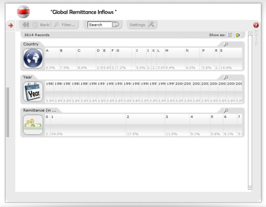
The global remittance economy is a booming one; the view provides information on the total amount of remittance ‘inflows’ each country has received during the period 1985-2010.

  • Which country receives the largest remittance income?
  • Do developing countries receive the largest slice of the global remittance pie?
  • How long has a country been in the remittance business? How much has its share changed?

Global Remittance Inflows [1985-2010]

View: Changes in Corruption Levels

Have you ever wondered about the level of corruption in a country? What do the citizens of each country think?

Transparency International, an international corruption watchdog organisation, has compiled data on the change in corruption levels in each country, as perceived by the general public in that country.

Which countries were thought to have reduced corruption levels? Has there been a change in the eyes of the public?

Changes In Corruption Levels

Teaser…

The inclusion of pie-charts into Datawunder was an extremely important milestone – we can now actually call it data visualization – in the development of the service.

However, pie-charts are but the tip of the iceberg; we have several new features in the pipeline. The next update or two will add more statistical functions to Datawunder. As such, users can choose from several methods of visualizing their statistical data. These ‘alternate views’ will also be dynamic; and users will be able to switch between them on the fly.

Bar Charts will be added in the next update to Datawunder. They will be similar to pie-charts i.e. they will be ‘clickable’, interactive and capable of filtering data.

Table/Grid Views: Further down the line, we also plan to introduce ‘table’ or ‘grid views’ to Datawunder.